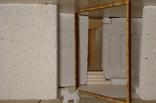
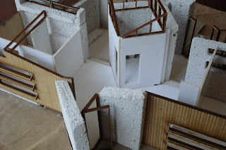
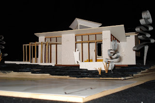
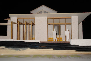
This is a flight around our Domus design. The video was created from the Sketchup model I did.
This second video is our Test+Refine final design.
Sunday, October 11, 2009
Final Drawings
Hand drawings for final presentation completed by Adelina and Melanie. By having handdrawn sketches it gives the presentation a 'home grown' feel, bringing you closer to the project, instead of computer made diagrams, which seem to separate the client and architect.
The 3D veiws are below.


The 3D veiws are below.


Sectional drawing:
Sunday, October 4, 2009
Copacabana 2 - Form changes, Shading and ESD
THE FORM
Not only was our initial design large in plan - but rather bulky in form too! Whether it be through errors in the 3d modeling - the structure needed to undergo extensive downsizing in volume to stand any chance at coming close to becoming something that could be considered as a passive design.
The removal of the mezzanine was enough to help decrease ceiling and building heights with now only having to work on the one level. The studio still retained its drop in level due to the natural slope of the site which would help create the cavity needed for our storage for amenities for guests when they would occupy the space. The sections of both buildings visually show the downsizing of the design.
SHADING
The alterations in form allowed us to add clerestory windows and ammend our outdoor shading with fixed louvres to block out the summer sun whilst letting in the winter sun when it is needed. Our final render pages (a few posts back) show this through the summer and winter solistice renders.


Not only was our initial design large in plan - but rather bulky in form too! Whether it be through errors in the 3d modeling - the structure needed to undergo extensive downsizing in volume to stand any chance at coming close to becoming something that could be considered as a passive design.
The removal of the mezzanine was enough to help decrease ceiling and building heights with now only having to work on the one level. The studio still retained its drop in level due to the natural slope of the site which would help create the cavity needed for our storage for amenities for guests when they would occupy the space.
 The sections of both buildings visually show the downsizing of the design.
SHADING
The alterations in form allowed us to add clerestory windows and ammend our outdoor shading with fixed louvres to block out the summer sun whilst letting in the winter sun when it is needed. Our final render pages (a few posts back) show this through the summer and winter solistice renders.


Copacabana 2 - What was involved in our redesign.
Working hard on test refine due to our "eye opening" and useful feedback from our domus review had led us to an extensive overhaul of how the building functioned, its size, its form and the all important esd components that needed to become of high priority for the dwelling that was to remain off grid.
THE PLAN
The initial feedback we had received from Domus in regards to our plan was simple and rather clear - the dwelling was too large. Our 3d and physical models had communicated this quite clearly, and test and refine had allowed us to re-think our views on required space and shrink the dwelling without losing the character and life that we as a group had injected into it. The initial size had been developed on the basis of the 8 guests - this factor during domus was a key problem in our designs - leading us to creating dedicated spaces purely for them.
With redesign this was no longer the case - the removal of the mezzanine level and providing extensive storage space in slide out draws in a cavity in the studio to hold upto 4 beds per draw rendered the mezzanine useless and helped us double up the use of our studio in a minima-esque fashion. This alone would remove 58 square metres of space from our domus design.
The further re-structuring of our social / living and kitchen areas, along with the studio space would reduce our domus footprint by 41%. The private spaces (ie. the bedrooms) would remained unchanged - featuring enough space already for each individuals personal affects and bed etc. These rather straightforward and simple changes towards a more energy efficient dwelling can be greatly seen in significant size changes of the dwelling.
The redesign had led us to implement new ideas, develop new shading and solar access ideas - as well as water catchment ideas - such as the implementation of two water tanks being into the compacted earth wall for catchment and a further increase of thermal mass withing the social spaces.
THE PLAN
The initial feedback we had received from Domus in regards to our plan was simple and rather clear - the dwelling was too large. Our 3d and physical models had communicated this quite clearly, and test and refine had allowed us to re-think our views on required space and shrink the dwelling without losing the character and life that we as a group had injected into it. The initial size had been developed on the basis of the 8 guests - this factor during domus was a key problem in our designs - leading us to creating dedicated spaces purely for them.
With redesign this was no longer the case - the removal of the mezzanine level and providing extensive storage space in slide out draws in a cavity in the studio to hold upto 4 beds per draw rendered the mezzanine useless and helped us double up the use of our studio in a minima-esque fashion. This alone would remove 58 square metres of space from our domus design.
The further re-structuring of our social / living and kitchen areas, along with the studio space would reduce our domus footprint by 41%. The private spaces (ie. the bedrooms) would remained unchanged - featuring enough space already for each individuals personal affects and bed etc.
 These rather straightforward and simple changes towards a more energy efficient dwelling can be greatly seen in significant size changes of the dwelling.
The redesign had led us to implement new ideas, develop new shading and solar access ideas - as well as water catchment ideas - such as the implementation of two water tanks being into the compacted earth wall for catchment and a further increase of thermal mass withing the social spaces.
Saturday, October 3, 2009
MINIMA
 SITE: My driving idea was to have my minima module suspended between the two buildings. Although it further complicated things I wanted to do something different and challenging.
  EXTERIOR OF FINAL DESIGN: MICROSTATION MODEL: Balcony located on the roof of the first level to create outlook and enable the occupants to get fresh air when living in such a small space.
VIEW OF INTERIOR : Bed and Desk
 VIEW OF INTERIOR: Eating area

VIEW FROM BALCONY
Subscribe to:
Comments (Atom)


