 this 3d model study helps us to understand the angle of the sun , penetrating to the building during the day. It' also used to guide us location and size of windows ,opening for lighting and ventilation purposes.
Sunday, August 30, 2009
Group : 2 Sun angle study
 this 3d model study helps us to understand the angle of the sun , penetrating to the building during the day. It' also used to guide us location and size of windows ,opening for lighting and ventilation purposes.
Orientation
Saturday, August 29, 2009
Group 3: Concept Model
Group 3; continuation from Mel's post


Friday, August 28, 2009
Thumbnails:
Below are some quick thumbnails from all members of the group. The first image came was inspired from the site and how it is sloped and how we could work with that to our advantage - in which i was able to come up with a fan like shape that rose gradually with the site. We explored this shape alot by playing with angles, elevating different elements off the ground - but we didn't like the elevated idea as much as we wanted it to look like it was emerging from the ground like a rock or flower.

The next thumbnail below was done by Adelina which she was exploring the use of cantilevered shapes emerging from the hillside and the placement of areas in space - varies zones. At this stage we also wanted to incorporate an underground area - but this ended up being scraped due to problems such as; tree roots, solar gain, natural sun light, etc.

In the thumbnail below done by myself and Hayden we started incorporating both my (fan effect) and Adelina's (cantilever) into one design, playing around with the placement and orientation of elements - shapes and how they would work effectively (just getting a basic floorplan). Whilst also taking into account the effects of the climate - north point (sun - placement of windows), wind, trees, etc.

Exploration Stage:
1 Image. Roof Plan
2 Image. Ground Level
3. Image. First Level
In designing we have chosen aspects from everyone's sketches and tried to incorporate them all in one. As myself and Hayden came up with the fan effect that gradually builds with the slope of the site - which we have arranged the bedrooms, kitchen and living quarters. Where Adelina was exploring with cantilevers and different formations. Alejandro did the climate analysis of the side and was exploring the thermal aspects of the building as well as having a green house - roof top terrace. Raghib was also trying to incorporate energy efficient qualities into the design such as; solar panels and a wind turbine and what angle best captured the light.
But the main feature of the house we believe is the cantilevered area that branches out into the landscape which is used for entertainment, garden, decking area.
With our design we have to accommodate for 4 permanent residents and 8 quests. So in our design we have incorporated 4 seperate rooms and 2 extra rooms plus an open study area to accommodate the guests. As we need not want to have several rooms for quests as they are not going to be fully occupied all the time. We wanted to have multi purpose rooms. ie. study/ bedroom.
In the green house we want to have our own little garden plus its also a space to store our grey and black water and filter it onto the garden - plants. So we thought that was efficient way to use that space. Were also thinking about under ground water tanks.
The materials we have chosen to use are also connected with the side - sandstone or some thought of stone which we were going to use as a thermal wall as well as incorporating concrete slabs for further thermal qualities.
We also want to add a lot of glass on the north side of the wall to let in alot of natural light which is also enhanced by the elevated roof.
However our design still needs further redevelopment as we believe it is quiet big at the moment so we miss to minimise the area a bit more....
-4.jpg) 1 Image. Roof Plan (Above)
1 Image. Roof Plan (Above)-3.jpg) 2 Image. Ground Level (above)
2 Image. Ground Level (above)-1.jpg) 3. Image. First Level (above)
3. Image. First Level (above)Thursday, August 27, 2009
Minima - The Loft


My Minima Design - The loft features two story living, a dedicated sleeping area up stairs and eating and wet area below. Focusing on ventilation and lighting, the upper level features a push out window to flush stale air with operable louvres to keep light out at night. Operable timber screens on the exterior allow for extra privacy and lighting. Access through a fold down door at the front - the upper window acting as shelter when open to act as an outdoor living space.
Wednesday, August 26, 2009
Last semester's 1to1!
Tuesday, August 25, 2009
Monday, August 24, 2009
Local Regulations
http://www.surfcoast.vic.gov.au/planning.htm?p6
Also check the Surf Coast Shire Planning Scheme, you will need to check section 54(ie 54.01 to 54.06)
http://www.dse.vic.gov.au/planningschemes/surfcoast/home.html
Sunday, August 23, 2009
This abstract, sculptural design was created by the aspects associated with the site - the Courtyard, such as; privacy (location of windows), winds, and direct sunlight to help generate power within this unit, etc. So i first started playing around with different angles and weird shapes to try and minise the space as much as possible. Also due to the final shape and materials chosen (aluminium cladding with interior timber lining) aloud the design to be a tension struction. I also made the design so it was demountable but spliting the structure into three sections or it could come flat packed, delivered to the site. So overall i was trying to make this unit as minimal as possbile but also a main sculptural element within the courtyard - Deakin Uni.


MINIMA - back to basics.


My space -A life giving machine drawing energy from nature.
A retreat out of this world. Flying high with no intrusion.
An energy cell to bolster my steel to wade the bureaucracy that awaits.


Lending to the surroundings are the material colours, textures, and the lines calculated from the midpoints of the timber grid upon which it lives.


- Credit -
Saturday, August 22, 2009
Materials
Floors
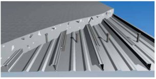
A composite concrete slab (i.e. Bondek) suspended on steel or concrete columns looks ideal. It provides us with Excellent spanning capacities for carpark space under, good thermal mass value and excellent fire rating of up to 4 hours.
 follow the link below for more information on Bondek
http://www.bluescopesteel.com.au/index.cfm/objectID.D85CCD4B-0558-11D4-89F000C04FCF6B8F
External Walls
exploring fire rated wall systems I came across IntRwall System by Boral. They are making a lot of promises with their product, such as
• A simple, cost-effective, panelised lightweight system that
can easily be installed by a plastering contractor.
• The readily available components are easy to handle and
install and don’t require heavy lifting.
• Simple assembly means faster construction and easier
inspection of acoustic and fire sealing.
• The plastering contractor installs all components
promoting
better coordination of site work.
• Services can be easily incorporated in the wall cavities.
• The system has a narrow footprint allowing an increased
usable area.
• Acoustic ratings up to Rw = 63dB, meeting and exceeding
BCA requirements.
• Fire ratings up to FRL -/120/120, meeting and exceeding
BCA requirements.
• If required, the stud centres can be reduced so that the system
can be used in areas subject to higher than normal pressures.
• Single layer of Shaftliner™ can be used to achieve FRL -/60/60.
• IBS rod in top track not required for FRL -/60/60 systems.
the assembly most attractive is the one below. note where i have marked:

Friday, August 21, 2009
Design process
Trying to allocate site locations to different zones using colors on site plan. Focusing on results from site analysis (i.e. fall of the land, location of the trees, solar access.etc) this is the final result which gave us the satisfaction.
Preliminary Sketches
Using the diagram we moved on to turn these colours into Domus.
This is result of all approaches, suggestions and solutions.
Our group decided to suspend floor on the north facing part of the building so we get better view and solar access. We also allocated that part of Domus to living areas (i.e. lounge, family).
As the building is stretches towards north, site falls away, floor doesn’t, that is how we create our suspended floor. We gain around 2 meters high space under floor. A little retaining wall would give us where we park the cars. Spiral staircase that leads us from carpark right to the entry which is locatetd at heart of our house, on the lower floor, and it continues its way up to 3 bedrooms upstairs.


